Data wrangling, feature engineering, and dada
And surrealism, and impressionism...
In my data science glossary, the entry for data wrangling gives this example: “If you have 900,000 birthYear values of the format yyyy-mm-dd and 100,000 of the format mm/dd/yyyy and you write a Perl script to convert the latter to look like the former so that you can use them all together, you’re doing data wrangling.” Data wrangling isn’t always cleanup of messy data, but can also be more creative, downright fun work that qualifies as what machine learning people call “feature engineering,” which Charles L. Parker described as “when you use your knowledge about the data to create fields that make machine learning algorithms work better.” In other words, you’re creating new fields (or features, or properties, or attributes, depending on your modeling frame of mind) from existing data to let systems do more with that data.
New York’s Museum of Modern Art released metadata about their complete collection on github, and I recently had a great time doing some data wrangling with it. I managed to transform the data so that it could answer interesting questions such as “who are the youngest painters in MoMA’s collection?” and “on average, which country’s painters make the biggest paintings?” Neither of these questions could be answered with a query against their original data.
I enjoyed working with this data so much because I went to MoMA pretty regularly during my years in New York City. In addition to iconic paintings such as Picasso’s Demoiselles d’Avignon, Dalí’s Persistence of Memory, and van Gogh’s The Starry Night, they have many key works by my own favorites such as Marcel Duchamp and Man Ray. My wife and I were members there for several years, which let us go to the members’ special openings of some exhibits, and through a friend of hers we sometimes got to go to the more exclusive pre-members’ openings where we’d see celebrities such as Chuck Close and David Bowie.
The data
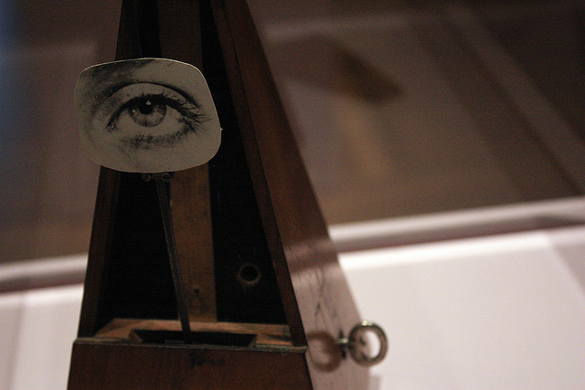
The data on github is a comma-separated value file with 123,920 rows and 14 columns that have labels across the top such as “ArtistBio”, “Medium”, and “Dimensions”. The feature engineering fun comes from looking in the more descriptive fields to find patterns that identify pieces of data that can be stored on their own with more structure so that they’re easier to query. For example, the smaller of their two Monet Water Lilies paintings has a “Dimensions” value of “6’ 6 1/2” x 19’ 7 1/2" (199.5 x 599 cm)" and Man Ray’s assemblage Indestructible Object (or Object to Be Destroyed) has a value of “8 7/8 x 4 3/8 x 4 5/8” (22.5 x 11 x 11.6 cm)". Along with that optional third dimension, other variations in this column include the use of the symbol “×” instead of the letter “x” and descriptive additions such as “Approx.” (174 works) or “irregular” (101).
I wrote a Python script that churned through this data and used regular expressions to pull individual pieces of information from several different fields. (Regular expressions, also known as regexes, offer ways to look for patterns in data such as “four numeric digits followed by optional space, a hyphen, optional space, and then either two or four digits”. O’Reilly has a whole book about them.) For the Dimensions field, my script pulled out the metric width, height, and, if included, the depth and descriptive note. My script, available with the resulting data on github, converts all the input fields and new data to RDF so that I could query it with SPARQL. For example, when writing the previous paragraph, I knocked out some quick SPARQL queries to find that the script had pulled “Approx.” from the Dimensions data 174 times and “irregular” 101 times.
I considered also outputting the results to a new CSV table with additional columns for the extracted properties, but when an artist like Elizabeth Catlett is listed as both American and Mexican, I wanted to output these two separate facts about her, which would require two columns or a separate artist nationality table to handle artists with multiple values for this field. This would be a pain with table-based data, but of course, it’s not an issue with RDF.
Artist nationalities came from the CSV file’s ArtistBio column, which had simple descriptions such as “(Swiss, born 1943)” and more complex ones such as “(French and Swiss, born Switzerland 1944)” and “(American, born Germany. 1886-1969)”. For each work’s artist, my Python script’s regular expressions pulled out nationality values, where they were born if specified, their birth years, and their death years (if specified) into separate RDF triples.
Not counting the header row and blank cells, the MoMA CSV file has 1,625,710 pieces of information in it. The resulting RDF has 2,364,277 triples, so it’s clearly much richer.
Queries to play with the new data
I could make many interesting queries against the original CSV values that were converted to triples with no manipulation, but the value of this feature engineering is clearer if we look at queries that take advantage of the new, extracted data. (For those interested in the geekier details, each bullet below links to the actual SPARQL query and results.) You’ll see that a common theme among the queries is doing a bit of arithmetic with numeric values extracted from the more descriptive CSV values, such as multiplying height by width to determine a work’s area.
-
What’s the single largest painting? At 798,972 square cm, James Rosenquist’s F-111. I knew of and had seen this work, but didn’t realize until looking at his Wikipedia page just now that F-111 was how this important sixties pop artist first came to the art world’s attention.
-
What’s the largest photograph? Mariah Robertson’s 11, which uses a thirty-inch-wide one-hundred-foot roll of photographs as part of a three-dimensional work. (I might not consider this a “Photograph”, but that is its Classification value in the original CSV data.)
-
What’s the largest three-dimensional work? The 1994 installation Stations by Bill Viola, who first became known as a video artist. (The piece includes five video projections.)
-
How many painters come from each country? No surprise that the U.S. leads with 494 artists, followed by the French, German, British, and other European countries until you get to Argentina in seventh place and Japan in eighth. The full list has 52 countries, and I thought Argentina’s high placement was interesting; off the top of my head I can’t name a single artist from that country.
-
What’s the average painting size by country? This query filters out countries with less than eleven paintings in the collection to increase the chance of getting a representative sampling, and again it’s not a surprise that the U.S. leads with an average painting size of 28,244 square cm. (I’m sure Rosenquist helped here.) The next few are Germany, Britain, Japan, and Italy, all with average sizes over 20,000 square cm. The Russians have the smallest paintings, with the 32 of them having an average size of 6,758 square cm. I’m sure that closer analysis would find smaller or larger sizes to be favored by particular artists who are well-represented in MoMA’s collection and skewing the average for their countries.
-
What are the oldest pieces in the collection and who made them? Besides a brocade from 1600 by “unknown”, there are four “Black basalt with glazed interior” works dated 1768 such as this sugar bowl. These are pretty old for a museum of modern art, but if you look at any of them you’ll see why they fit right into the collection. And, they’re credited to a familiar name: Josiah Wedgwood, founder of the company that bears his name.
-
Who are the five youngest painters with work in the collection? One work apparently co-credited to two artists gives us a total of six names, all born in the eighties, and none of whom I’ve heard of.
Most of these queries focus on work in specific media because broader versions often ran into data anomalies that led to odd answers. For example, a query for the work in the collection took the longest to create showed several photographs that apparently took over a hundred years. I assume that the elapsed time represented the span between the exposure of the negatives and the creation of the prints in MoMA’s collection. A query for the oldest living artist seemed simple enough–just look for the earliest birth year with no corresponding death year, but it turned out that there was no death date recorded for one artist born in 1731. (Sometimes the data has question marks as a birth or death date, but I didn’t want to store those in a property that I’d use to perform arithmetic.) A query about the youngest artist in the whole collection found that it was someone named “Technology will save us” born in 2012–clearly a collective founded in that year and not a person. Also, since all artist names and information are properties of a “work”, an artist whose name is spelled two different ways will be considered as two different artists with the current setup.
Other odd answers led to tweaks to the regular expressions and other logic in the data conversion and queries, but at some point, unless someone’s paying you otherwise, you’ve got to quit and make the best you can of what you have. (On this topic, I highly recommend Jeni Tennison’s classic Five Stages of Data Grief.)
Even if my script doesn’t create perfect data about every work in MoMA’s collection, the data it creates still offers plenty to query. I think it demonstrates pretty nicely how data wrangling techniques such as the use of regular expressions–in addition to cleaning up messes such as badly formatted data–can do the kind of feature engineering that improve a dataset to make it even more useful.
Photo of Man Ray’s “Indestructible Object (or Object to be Destroyed)” by Chris Barker via Flickr (CC BY-NC-ND 2.0)
Share this post