Making charts out of SPARQL query results with sgvizler
Embed a query in your HTML, name an endpoint, and pick a chart type.
I finally got around to trying sgvizler, and I wish I’d done so earlier. Once your HTML page references the sgvizler JavaScript and CSS, you can specify a query to send to any SPARQL endpoint you want and then see a chart of the query results on that web page. Scroll down a bit on sgvizler’s Google code home page and you’ll see a nice range of available chart types.
After I downloaded and unzipped the sgvizler distribution (a file that, before unzipping, was all of 72K in size) I had a directory with a few files and an example subdirectory. One of the files was sgvizler.html, which displays a SNORQL-like form where you can enter queries to send off to the http://sws.ifi.uio.no/sparql/world endpoint. The page includes a lot of JavaScript code where you can change the endpoint and other parameters; I had some trouble figuring this out and was happy to find that the files in the example subdirectory were much more minimal and only required the setting of attributes on an HTML div element to configure.
Based on those examples, I created a simple web page using sgvizler that creates a Revenue and operating income of US computer companies chart using data from DBpedia. If you follow the link in the previous sentence, you’ll see the image dynamically generated. Here’s a screen shot:
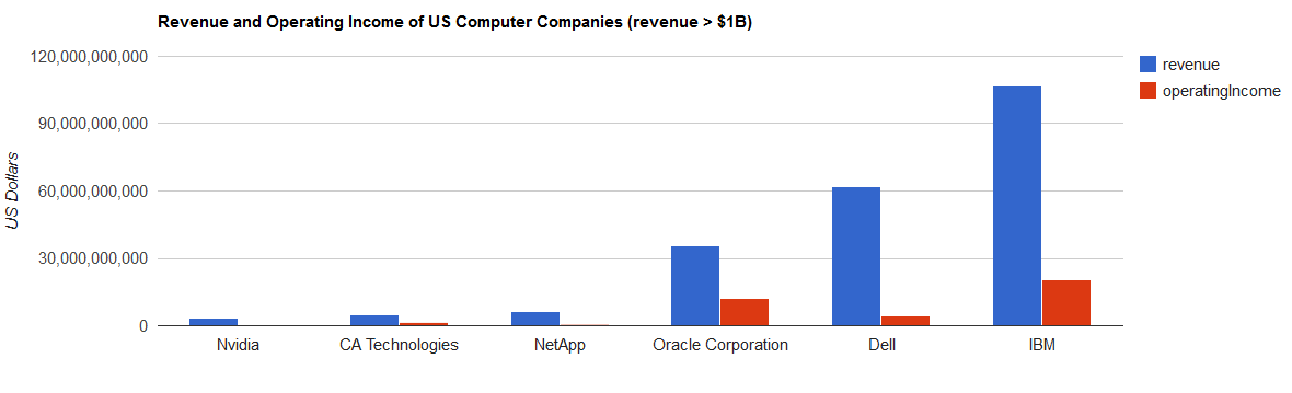
If you follow that link and do a View Source you’ll see that very little was required besides the URL of the endpoint and the query itself. The HTML head element has some link and script elements that point to appropriate sgvizler JavaScript and CSS files, and then the actual chart is specified with an empty div element that enumerates details with various attributes:
 <div id="sgvzl_example_query"
   data-sgvizler-endpoint="http://dbpedia.org/sparql"
   data-sgvizler-chart="gColumnChart"
   data-sgvizler-chart-options="title=Revenue and Operating Income of US Computer Companies (revenue > $1B)|
                                vAxis.title=US Dollars|chartArea.left=150"
   data-sgvizler-loglevel="2"
   style="width:1200px; height:400px;"
   data-sgvizler-query='
     PREFIX dbo: <http://dbpedia.org/ontology/>
     PREFIX dct: <http://purl.org/dc/terms/>
     SELECT ?name ?revenue ?operatingIncome
     WHERE {
       ?company rdfs:label ?taggedName ;
               dct:subject <http://dbpedia.org/resource/Category:Computer_companies_of_the_United_States> ;
               dbo:revenue ?revenueFloat ;
               dbo:operatingIncome ?opIncomeFloat .
        BIND(xsd:integer(?revenueFloat) AS ?revenue) .
        BIND(xsd:integer(?opIncomeFloat) AS ?operatingIncome) .
        BIND(str(?taggedName)AS ?name)
        FILTER(lang(?taggedName) = "en")
        FILTER(?revenue > 1000000000)
     }
     ORDER BY ?revenue
'></div>
The use of the different attributes is documented on their UsingSgvizler Google code page. Note how the actual SPARQL query, bolded above, is just another attribute value: data-sgvizler-query. (Also note that each < character in the query must be represented as the entity reference < because it’s inside of an attribute value.)
Because sgvizler builds on Google charts, the options for the data-sgvizler-chart-options attribute depend on which chart type you select in the data-sgvizler-chart attribute; see the sgvizler home page for named examples of the options. I picked gColumnChart for image above and found options like title and vAxis.title at the Google Charts Visualization: Column Chart page. (I haven’t tried any of the animation or interactivity options, and I’m not sure which sgvizler supports, but they sound like fun.)
With my USComputerCompanies.html file sitting on my hard disk and the appropriate sgvizler files in its parent directory, I could do a File/Open from Chrome or Firefox and the generated image displayed just fine. It turns out that the image doesn’t necessarily display when opening an HTML page like this if the SPARQL endpoint that it references is local, as opposed to being remote like DBpedia. I think this is because of some jQuery features to prevent malicious code from doing damage. To make it work with a local endpoint, the key is to point your browser at a local web server and open the HTML file with an http:// URL instead of using File/Open to open it as if it were a file:/// URL. As far as I could tell, this was necessary with any HTML file that used sgvizler to send a SPARQL query to an endpoint at http://localhost.
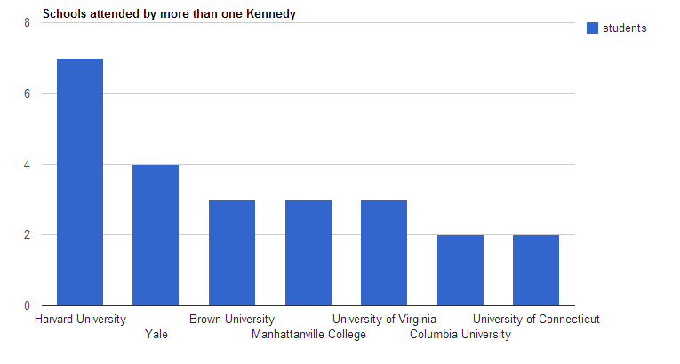
For example, TopBraid Composer Maestro Edition can act as a local SPARQL endpoint, but sgvizler wouldn’t create a chart of results retrieved from http://localhost:8083/tbl/sparql when I displayed my tbtest.html file by selecting File/Open in my browser. When I put tbtest.html in a tbl-www\sgvtest\sample subdirectory of a project called sandbox and the appropriate sgvizler files in the tbl-www\sample directory, sgvizler had no problem when I sent a browser to http://localhost:8083/tbl/data/sandbox/sgvtest/sample/tbtest.html, and displayed this graph of which schools had more than one attendee from the Kennedys extended family:
A different example: using Sesame as a local endpoint, I created a sesameTest.html file that sent a SPARQL query to the Sesame endpoint http://localhost:8080/openrdf-sesame/repositories/myRepo. When I stored the HTML file in webapps\ROOT\sgvtest\samples in the Tomcat directory where I was running Sesame (ROOT being where you’d store files being delivered by Tomcat acting as a regular web server outside of the Sesame servlet), I opened up the web page as http://localhost:8080/sgvtest/samples/sesameTest.html and sgvizler generated the test graph from the results of that page’s SPARQL query just fine, unlike when I opened the same file with File/Open.
All my tests showed one chart at a time, but some examples on the sgvizler web site show how easy it is to display multiple graphs at once.
Between the range of available charts, the extra attributes available to customize each chart type’s appearance, the fact that I eventually got it to work with every SPARQL endpoint that I tried it with, and the ability to set everything up by merely entering values in div attributes in an HTML page with no JavaScript wrangling necessary, I am very impressed with sgvizler. I look forward to using it more.

Share this post