Visualizing DBpedia geographic data
With some help from SPARQL.
I’ve been learning about Geographical Information System (GIS) data lately. More and more projects and businesses are doing interesting things by associating new kinds of data with specific latitude/longitude pairs; this data might be about air quality, real estate prices, or the make and model of the nearest Uber car.
DBpedia has a lot of latitude and longitude data, and SPARQL queries let you associate it with other data. Because you can retrieve these query results as CSV files, and many GIS packages can read CSV data, you can do a lot of similar interesting things yourself.
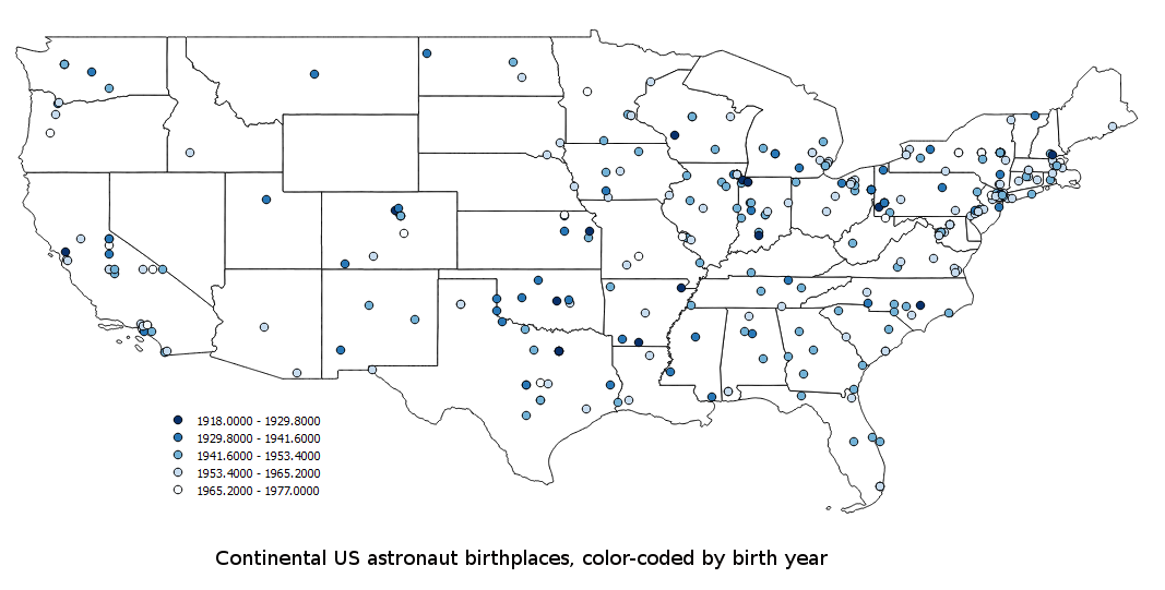
A query of DBpedia data about American astronauts shows that the oldest one was born in 1918 and the youngest one was born in 1979. I wondered whether, over time, there were any patterns in what part of the country they came from, and I managed to combine a DBpedia SPARQL query with an open-source GIS visualization package to create the map shown here.
The following query asks for the birth year and latitude and longitude of the birthplace of each American astronaut:
SELECT (MAX(?latitude) AS ?maxlat) (MAX(?longitude) AS ?maxlong)
       ?astronaut (substr(str(MAX(?birthYear)),1,4) AS ?by)
  WHERE {
  ?astronaut dcterms:subject category:American_astronauts ;
             dbpedia-owl:birthPlace ?birthPlace ;
             dbpedia-owl:birthYear ?birthYear ;
              dbpedia2:nationality :United_States .
  ?birthPlace geo:lat ?latitude ;
              geo:long ?longitude .
}
GROUP BY ?astronaut
(The query has no prefix declarations because it uses the ones built into DBpedia. Also, because some places have more than one pair of geo:lat and geo:long values, I found it simplest to just take the maximum value of each to get one pair for each astronaut.) The following shows the first few lines of the result when I asked for CSV:
"maxlat","maxlong","astronaut","by"
37.195,-93.2861,"http://dbpedia.org/resource/Janet_L._Kavandi","1959"
42.6461,-83.2925,"http://dbpedia.org/resource/Brent_W._Jett,_Jr.","1958"
40.1,-75.0997,"http://dbpedia.org/resource/John-David_F._Bartoe","1944"
QGIS Desktop is an open-source tool for working with GIS data that, among other things, lets you visualize data. The data can come from disk files or from several other sources, including the PostGIS add-on to the PostgreSQL database, which lets you scale up pretty far in the amount of data you can work with.
Using QGIS to create the image above, I first loaded the shapefile (actually a collection of files, including an old-fashioned dBase dbf file) from the US Census website with outlines of the individual states of the United States.
GIS visualization is often about layering of data such as state boundaries, altitude data, and roads to see the combined effects; those little cars in your phone’s Uber app would like kind of silly if the roads and your current location weren’t shown with them. For my experiment, the census shapefile was my first layer, and QGIS Desktop’s “Add Delimited Text Layer” feature let me add the results of my SPARQL query about astronaut data as another layer. One tricky bit for us GIS novices is that these tools usually ask you to specify a Coordinate Reference System for any set of data, typically as an EPSG number, and there are a lot of those out there. I used EPSG 4269.
At first, QGIS added in all the astronaut birthplace locations as little black circles filled with the same shade of green. It had also set the default fill color of the US map to green, so I reset that to white in the dialog box for configuring that layer’s properties. Then, in the astronaut data layer’s properties, I found that instead of using identical symbols to represent each point on the map, I could pick “Graduated” and specify a “color ramp” that QGIS would use to assign color values according to the values in the property that I selected for this: by, or birth year, which you’ll recognized from the fourth column of the sample CSV output above. QGIS looked at the lowest and highest of these values and offered to assign the following colors to by values in the ranges shown, and I just accepted the default:
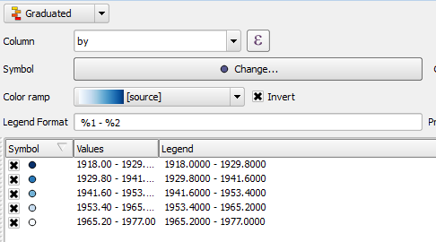
(While the earlier query showed a few astronauts born in 1978 and 1979, the range here only goes up to 1977 because I now see that some geographic coordinates in DBpedia are specified with dbpprop:latitude and dbpprop:longitude instead of geo:lat and geo:long, so if I was redoing this I’d revise the query to take those into account.)
If you click on the map above to see the larger image, you’ll see that many early astronauts came from the midwest, and then over time, they gradually came from the four corners of the continental US. Why so many from the New York City area and none from Wyoming? Is there something in New York more conducive to producing astronauts than the wide-open spaces of Wyoming? Yes: there are more people there, so the odds are that more astronauts will come from there. See this excellent xkcd cartoon for more on this principle.
I only scratched the surface of what QGIS can do. I found this video from the Vermont Center for Geographic Info to be an excellent introduction. I learned from it and the book PostGIS in Action that an important set of features that GIS systems such as QGIS add is the automation of some of the math involved in computing distances and areas, which is not simple geometry because it takes place on the curved surface of the earth. A package like PostGIS adds specialized datatypes and functions to a general-purpose database like PostgreSQL to do the more difficult parts of the geography math. This lets your SQL queries do proximity analysis and other GIS tasks as well as handing off of such data to a visualization tool such as QGIS. (The open-source GeoMesa database adds similar features to Apache Accumulo and Google BigTable for more Hadoop-scale applications.)
The great news for SPARQL users is that a GIS extension called GeoSPARQL does something similar. You can try it out at the geosparql.org website. For example, entering the following query there will list all the airports within 10 miles of New York City:
PREFIX spatial:<http://jena.apache.org/spatial#>
PREFIX rdfs: <http://www.w3.org/2000/01/rdf-schema#>
PREFIX geo:<http://www.w3.org/2003/01/geo/wgs84_pos#>
PREFIX gn:<http://www.geonames.org/ontology#>


Select ?name
WHERE{
  ?object spatial:nearby(40.712700 -74.005898 10 'mi').
  ?object a <http://www.lotico.com/ontology/Airport> ;
  gn:name ?name
}
(The data uses a fairly broad definition of “airport,” including heliports and seaplane bases.) I have not played with any GeoSPARQL implementations outside of geosparql.org, but the Parliament one mentioned on the GeoSPARQL wikipedia page looks interesting. I have not played much with the Linked Open Streeet Map SPARQL endpoint, but it also looks great for people who interested in GIS and SPARQL.
Whether you try out GeoSPARQL or not, when you take DBpedia’s ability to associate such a broad range of data with geographic coordinates, and you combine that with the ability of GIS visualization tools like QGIS to work with that data (especially the ability to visualize the associated data—in my case, the color coding of astronaut birth years), you have a vast new category of cool things you can do with SPARQL.

Share this post