Linked Open Data Cloud: The Animated GIF!
My first animated GIF.
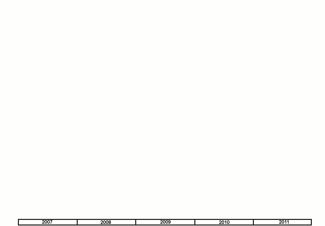
I’ve had a new respect for animated GIFs since reading Anil Dash’s blog posting Animated GIFs triumphant. When I found that I could create them with gimp, a program on my top five list of software to install on a brand new machine, I couldn’t resist trying to make one. I have plenty of PowerPoint presentations where a series of slides show the growth of the Linked Data Cloud, so I made the animated GIF you see here of the available diagrams. Click it to see the full-sized version.
While the hilarious You Suck at Photoshop videos are a deliberate parody, the YouTube video Animated Gif Tutorial GIMP 2.6 seems like an untintentional parody, with someone using a jigsaw and other crashing noises in the background, but it did showed me what I had to do. (For one thing, I had to get more comfortable using gimp layers.)
If you’re wondering why there haven’t been any new diagrams since September of 2011, the answer is good news: the network of available linked open data sites just got too big to fit into such a diagram. People are making new linked data sources available all the time, both small and experimental and large and robust-looking. Lately a lot of people have been complaining about the existence of unreliable public SPARQL endpoints out there; I prefer to concentrate on the ones that work, like the new EMBL-EBI one. (The regular web has plenty of dead sites too. And, I don’t build applications with dynamic dependencies on public endpoints. If they have data that will be useful to me, I use SPARQL queries to pull that data down where I can store it locally. I mean, duh.)
My animation shows a very exciting period in the history of the growth of linked data. And, for an added bonus, I’m sure its transition from black and white to color reminds you of the corresponding moment of the “The Wizard of Oz,” right?

Share this post